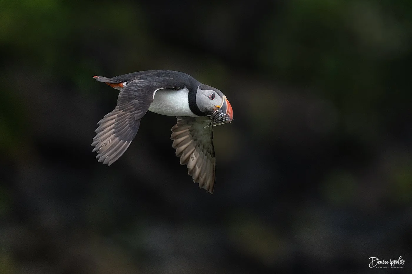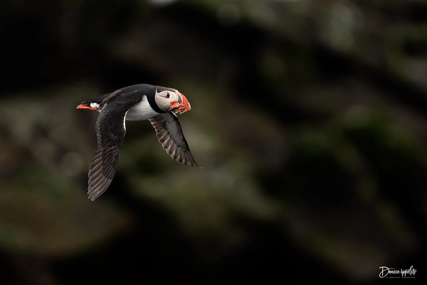
I am heading home from Grimsey Island off the north coast of Iceland. It is a very popular breeding spot for Atlantic puffin and other seabirds. I mainly chose to start doing workshops on Grimsey because:
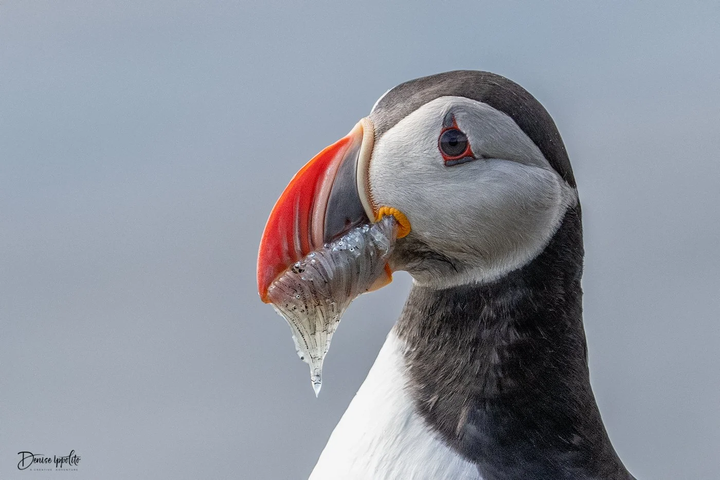
I absolutely love puffins and the UK (Farne Islands, where I used to run puffin workshops) kind of fizzled out in terms of photography after Covid and then being hit hard with avian flu. The boats changed their landing times and the shortened time on the islands didn't work for me.
The light on Grimsey can be amazing in the evenings, not to mention the midnight sun and all the opportunities it brings.
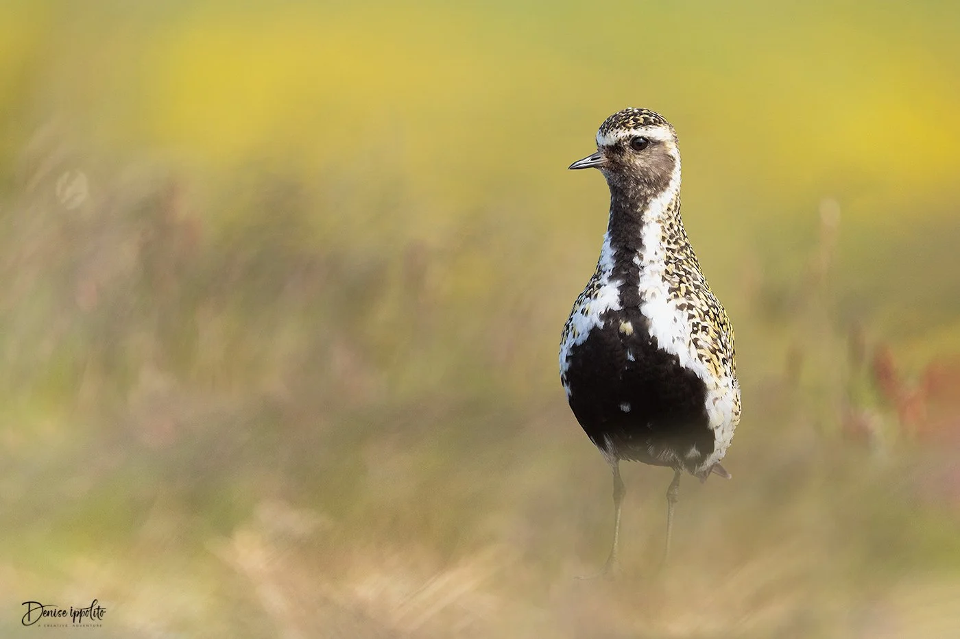
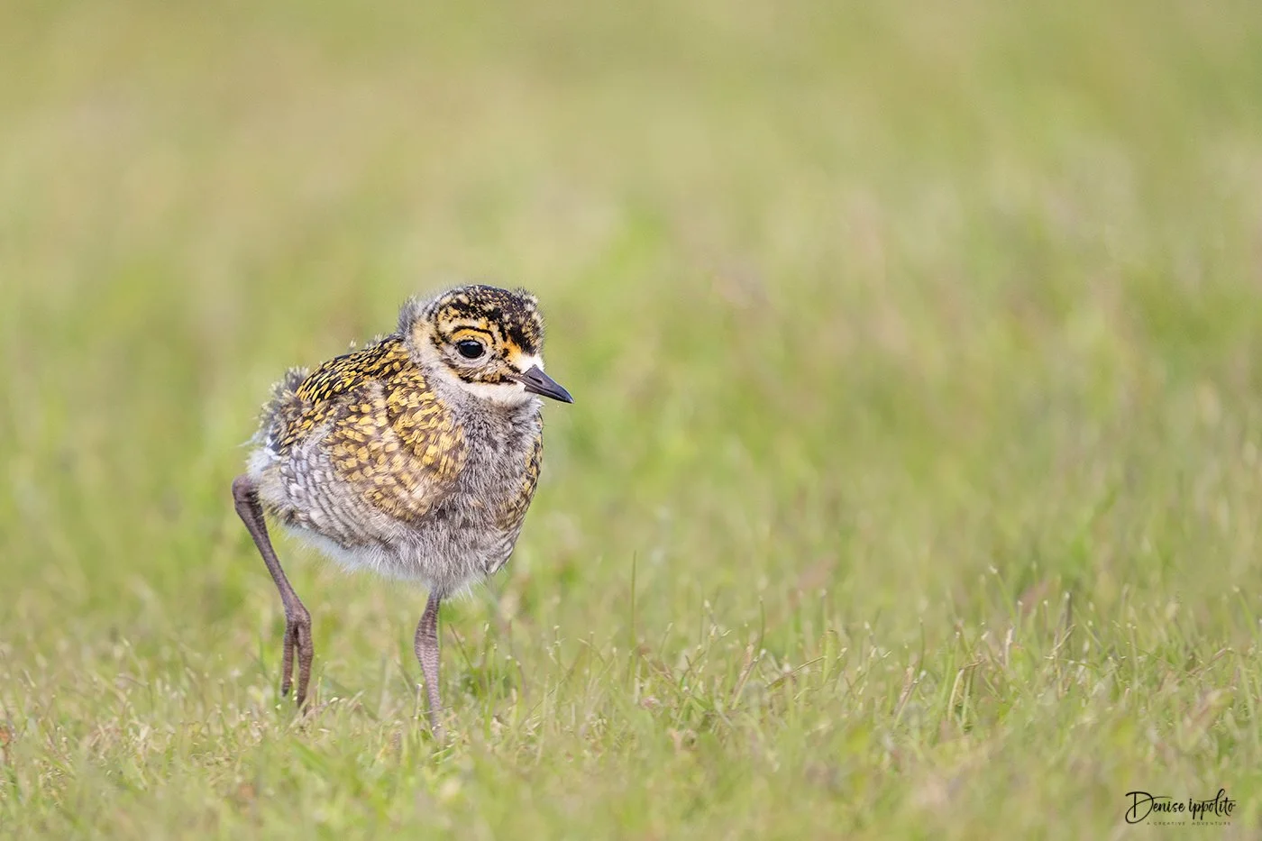
The island offers several different areas to photograph at. There is a large pond that is generally filled with terns, ducks and shorebirds, there is a beach area that has lots of Oystercatchers on rocks, phalaropes, godwit, plovers and such, there are basalt columns that add an interesting element to your photos, a lighthouse with Northern fulmar nesting near the cliffs, the harbor area is a great place to photograph Black guillemot, Arctic terns, Common eiders and more. Not to mention the thousands of puffins, razorbills and guillemot on the cliffs.
You can walk freely about. There are no restricted paths or time limits to hinder photography. But, you must always be respectful of the wildlife and be careful not to stand in front of -or trample any burrows. Also, if you are photographing in one spot near where the puffins burrow it is a good idea to rotate your position frequently in case you are inadvertently too close to a burrow. Tiny tern chicks can line the roads, so drive slowly and carefully.
Grimsey is a close knit community with a small grocery store (really small), gift shop, food truck( they sell cod dogs), bar/ restaurant where you will find that the fish of the day is always a good choice. Donna and I really like the owners and their staff, they have made us feel most welcomed. Our host is also a gem, we love her!
When everyone else is fighting hot summer heat, Grimsey is pretty cool at around 50 degrees Fahrenheit on average.
Overall Grimsey has won my vote for one of the best places to photograph puffins.
On this trip Donna Bourdon was co-leading but moving forward Donna and I will rotate years. Next year my trip is “sold out” but we just listed Donna’s 2027 trip if you are interested in joining her.
We had pretty good weather during our trip. The locals were sun bathing because it had been overcast with rain for weeks before we arrived. With light all day and night it’s hard to decide when to shoot and when to rest. I know that you’re thinking poor us! There were lots of whales just off the coast, they were fun to listen to and watch.
Overall we had a fantastic trip. It always makes me feel good when everyone leaves the workshop with great memories and photos to share.
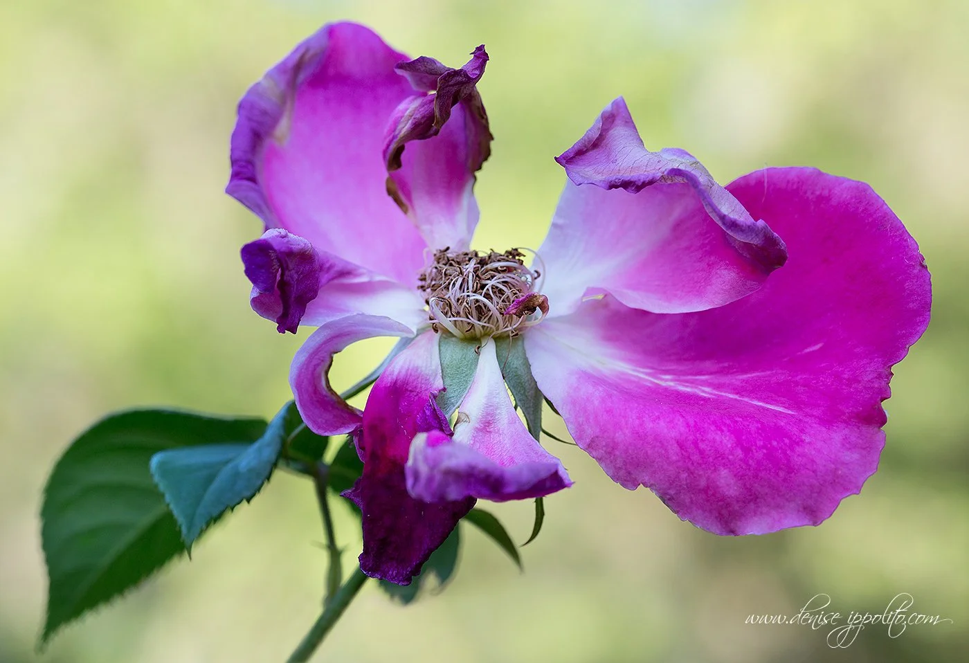
These are a few of my favorites from the trip. CLICK ONTHE PHOTO TO SEE THE LARGER IMAGE